Gestalt Principles
In the 1920s, group of German psychologists established a set of theories around visual perception. These are applicable today and are used by designers in many formats.
Layout is how you organise your content, both text and visual. Your layout should guide readers to process information in a clear and logical way.
Aspect
Consider your format. An A4 document, Facebook/Instagram post or website all have different dimensions. Make the layout work for the format you're in.
Alignment
Once you know your dimensions, consider using a grid. It helps to create a balanced layout and to ensure the various elements are aligned.
Establish focal point
This could be a headline or an image. Place it in an area for maximum impact.
Balance
Information is displayed in a way that makes use of the space in a evenly distributed way.
White space
White space area areas on a document that are empty. Having empty space enables certain elements to be grouped together and guides readers.
Hierarchy
We've mentioned hierarchy in using type and colour but it's equally if not more important in considering your layout. The use of hierarchy tells reader where to go first and which part of the layout are more important.
User behaviours
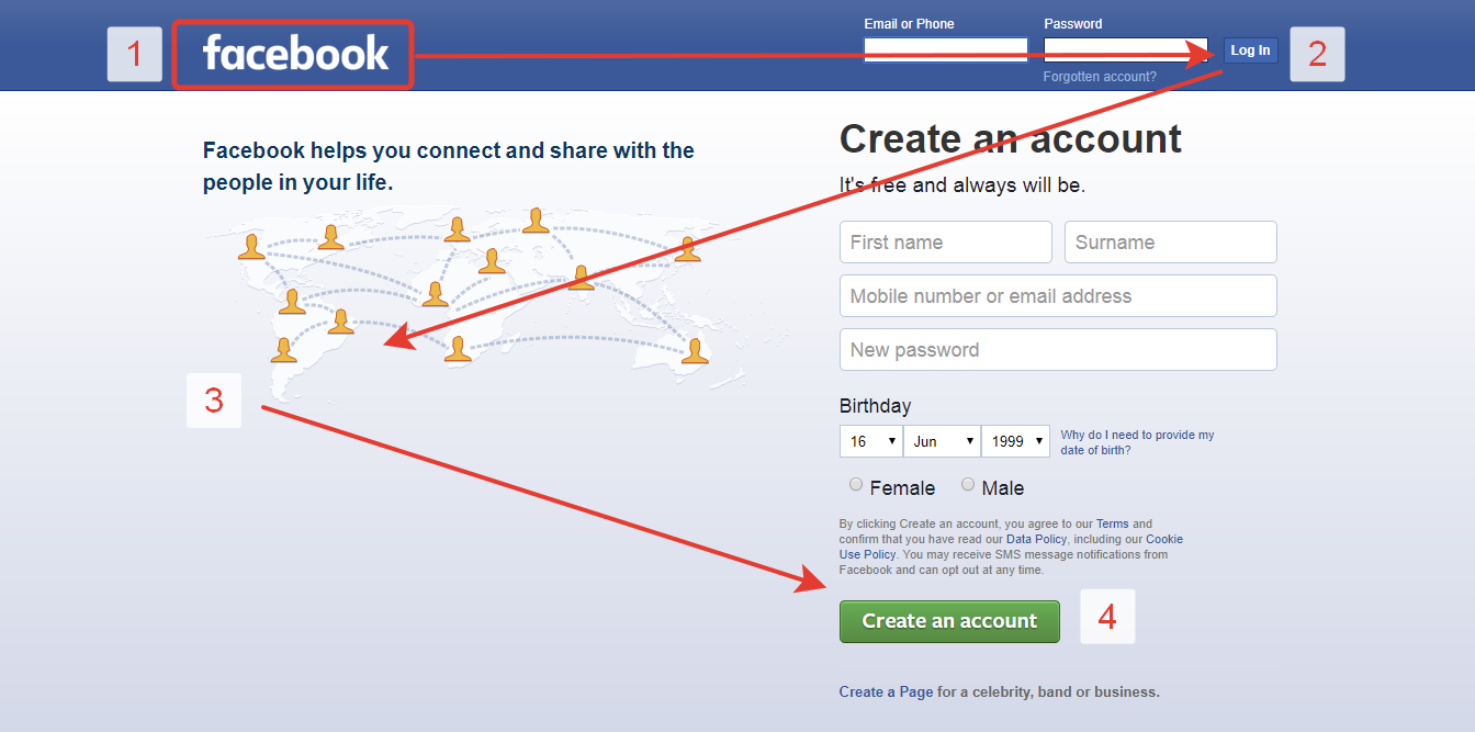
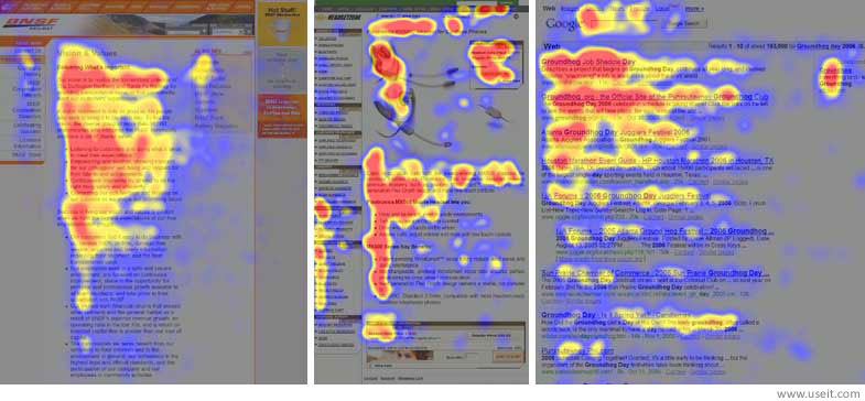
Reader behaviours differ depending on the medium and content. For instance, people are more likely to scan on the internet, often in a Z-pattern (see the Facebook image below). For longer blocks of text, the scanning pattern tends towards the F-pattern. So design accordingly!


Rajapakshe, E 2017, UX enhancing design layouts (The Z-pattern and the F-pattern), The Geveo Blog, viewed 24 March 2021, http://blog.geveo.com/UX-enhancing-design-layouts